In Part 1 I discussed the (ab)use of SAVINGS. In Part 2 the focus went to DOLLAR per UNIT. In this third, and for now final, episode of Marketing Metrics Fallacies I want to go after the Improvement Metric Fallacy. This is the most common metric but also the one that is more wrong than right.
The Improvement Metric Fallacy
Every new product that comes along will be marketed with a few improvement claims. They come in two flavours but are in essence the same. You have the 10X improvement or the 237% improvement. Marketing slidedecks are filled with them. Although the numbers as could have happened and could be true somewhere they will most probably NOT be of any value to your environment.
Let me explain again with a graphic. Below we have a generic Bell-curve. A bell curve follows a normal distribution. In our case we will see how many use cases (X-axis) benefit a specific amount of improvement (Y-axis). Little to no improvement (hopefully) will count for a very low amount of use cases, the big bulk of use cases will fit in the middle and little to no use cases will see extreme improvements in their daily environment.
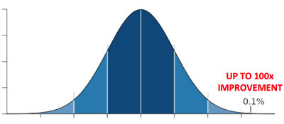
The numbers given in most slide-decks, and especially on new product launches, will come from that part of the scale. They are either academic numbers (ex IOps benchmarks) or environments pushed to their limits under little to no stress usage.
The (honest) Use Case
There is a way to tackle this. What we see more and more is that marketing will use existing Use Cases. I truly support this. This is what happened to this customer in this type of environment. Hopefully that use case is presented by the customer so that you could actually ask some questions to how real these numbers are.
Where it goes wrong again is that this use case is a very specific use case. Like we see in our bell curve is that ANY USE case is at a specific point in the curve. It’s by it’s very own nature of being a use case within a specific % of customers (being 1). Would that % be somewhere in the 50’s? I highly doubt it!
the big summary
In essence there is nothing wrong with using numbers in marketing. What is wrong is using numbers to obfuscate the truth! What is wrong is thinking your audience is so naive to believe every single number you provide them. Do not insult the intelligence of your audience! The classic one-liner you will get at the bar after such a presentation is:
did you know 37,5 % of all numbers used in a powerpoint are made up on the spot?
So how to do it right?
- don't use numbers that are not backed by research – I hope this speaks for itself
- give context on that specific number – how is this measured, what was the load, what are the tools, …
- find which type of environment is at what point of the bell curve and give them all
UPDATE
I praise where possible, heckle where necessary. After heckling marketing for the last three posts I have to praise PureStorage (Vaughn Stewart) for this piece of brilliance that says exactly what I asked for. Source
disclaimer: PureStorage is a customer of HaDeLe services.
[…] another cheap-shot campaign (like others do as well where I heckle a well), but this is already the second time I have to praise them for doing what I feel is the right thing to help answer the real question the […]